
When I Set Out to Build a Brand, I Refused to Build Someone Else’s.


Most photographer branding shoots look the same. White studio. A chair. Maybe a camera body or a curl of film negative resting just so on a tabletop. And look — they’re classic for a reason. But they’re fundamentally not me, and I wasn’t willing to let them be the first impression of my work.
As a Seattle-based film wedding photographer, my entire practice is built around the idea that images should say something — not just document that something happened. So when it came time to create branding photos for my own business, I held them to the same standard I hold every frame I shoot for my couples: does this speak? Does this feel like something?
It had to.

Branding Photos Are More Than a Face. They’re a Vision.
I wanted these images to communicate my artistic identity — the obsessions, the references, the visual language that quietly lives inside every roll of film I shoot. And I wanted them to integrate so seamlessly with my website that you’d swear the two were designed around each other. (They kind of were.)
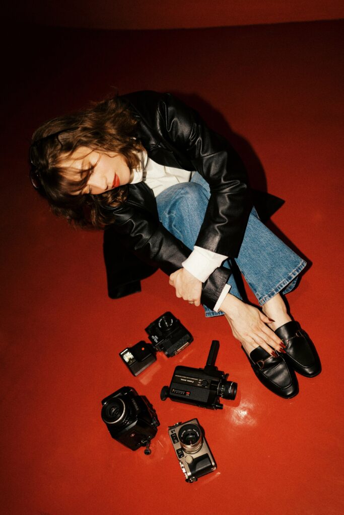
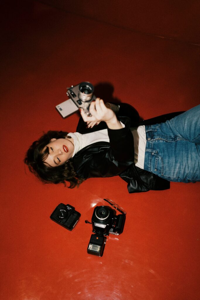
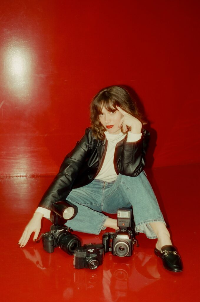
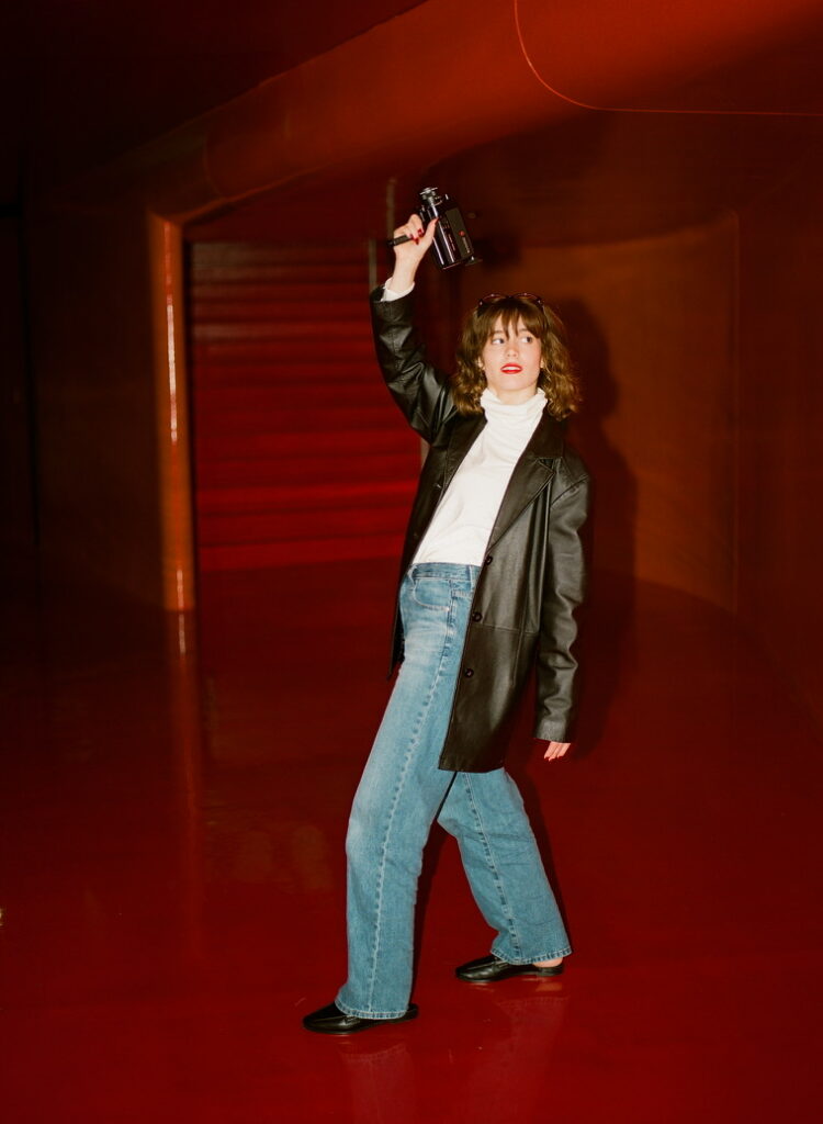
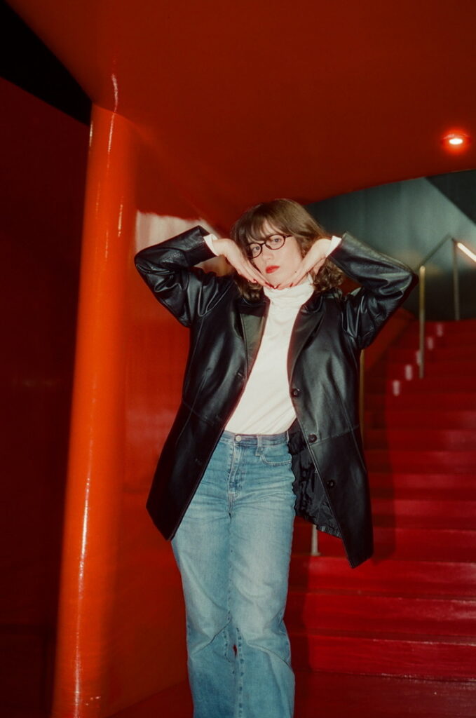
My site is deeply rooted in the aesthetics of 70s, 80s, and early 90s editorial and campaign photography. I’ve been drawn to that era since I was a little girl, and that pull has only deepened as I’ve gotten older — probably because most of the film cameras I work with came from those decades. Shooting on a camera that lived through the 80s changes how you see through it. My website was always meant to feel like a magazine from that era — because that’s the canvas I imagine my photos living inside.

The References That Made These Photos What They Are
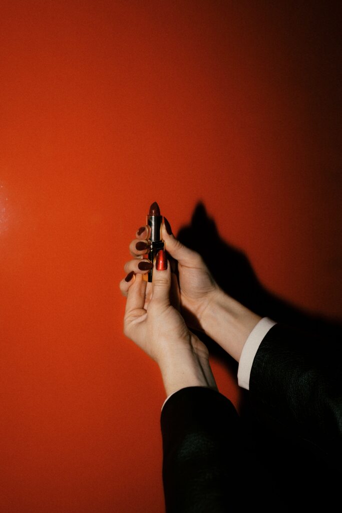
The shoot’s primary inspiration? David Bowie’s Red sessions with photographer Masayoshi Sukita, shot in 1972. That stark crimson backdrop. The severity of a black suit. The strange, almost uncomfortable intentionality of the poses. There’s nothing accidental about those images — and that’s exactly what I wanted to channel.
Red has always captivated me, especially in how it renders on analog film. It doesn’t just sit in a frame — it pulses. It commands. I think about the Red Room dream sequence in Twin Peaks: Fire Walk With Me (which, in a detail that still feels unreal to me, was filmed at my actual high school). I think about Emerald Fennell’s Wuthering Heights, shot on film, where red doesn’t just happen — it intentionally weaves throughout the story.
These aren’t just aesthetic references. They’re emotional ones. Red on film is editorial and alive in a way that’s hard to manufacture in post. It was the only choice.


This Shoot Is, Unapologetically, Me.
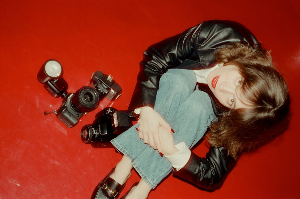
Film. Artsy. Specific. A little strange in the best way. Uninterested in safe.
I believe photographs should speak a thousand words — not just confirm that someone was standing in a room. That’s the philosophy behind my wedding work, and it’s the same one I brought to these branding images. If you’re a couple who wants pictures that feel like something — that carry the actual texture of your day rather than a highlight-reel version of it — I think you’ll feel that in these photos.
This is what it looks like when a Seattle film photographer stops making work for the algorithm and starts making work for the archive.


Elita Coralee is a documentary film wedding photographer based in Seattle, Washington, available for weddings and elopements across the Pacific Northwest, West Coast, Europe and other worldwide destinations. She shoots on 35mm, 120 medium format, and Super 8.
Leave a Reply
elita coralee
Based in Washington. Traveling anywhere for love. Documentary and photojournalistic style, leaning into the small, candid details that make your day uniquely yours.
